The 3rd in a series about how big ideas are good for business.
There is a common misconception that a logo is a brand. Although important, a logo is only a visual representation of the brand. However, if done properly, it can also be the foundation for everything — informing how the brand goes to market and communicates in addition to leading the development of the overall look and feel. Pretty powerful stuff. No, a logo is not the brand, but it is a crucial piece to building a strong one. And, for whatever reason, logos sure are undervalued nowadays.
If logos are so important, then why are they undervalued? Is it cost? Is it because sites like 99 Designs offer buyers five design options for a 100 bucks? Or Fiverr, where you can farm out the logo to a hungry designer in some far off corner of the world for $10.00 or less?
Then there’s the Nike mythology. As the story goes, Phil Knight paid an art student at Oregon $35.00 for the Nike swoosh, and they seem to have done pretty well with it over the years. But how many times in the history of branding has there been this kind of wild success?
Sure, cost is one thing, but this leads to another misconception — that logos are easy to make. They’re so small and simple, logos should come quick and be cheap? That’s hard to argue with when you look at many of the latest designs on sites like Brand New. There are a lot of logos out there that look like they were thrown together, lacking in overall quality, and haring a certain sameness. Why should you pay good money for an ordinary logo?
Along those lines, a logo can indeed be a very simple image. So as logic dictates, certainly if it did not have taken THAT long to create, it shouldn’t cost that much.
But here’s the misnomer, it’s not about the time spent on creating the logo; it’s about how valuable the end product is.
An example from design lore: Paula Scher was engaged by CitiBank after they had merged with Travelers, to design a new identity. Legend has it, Ms. Scher drew the initial design for the logo right then and there in the conference room while the meeting was going on. That design now graces their cards, business papers, signage, sites, and virtually every piece of marketing material they produce.

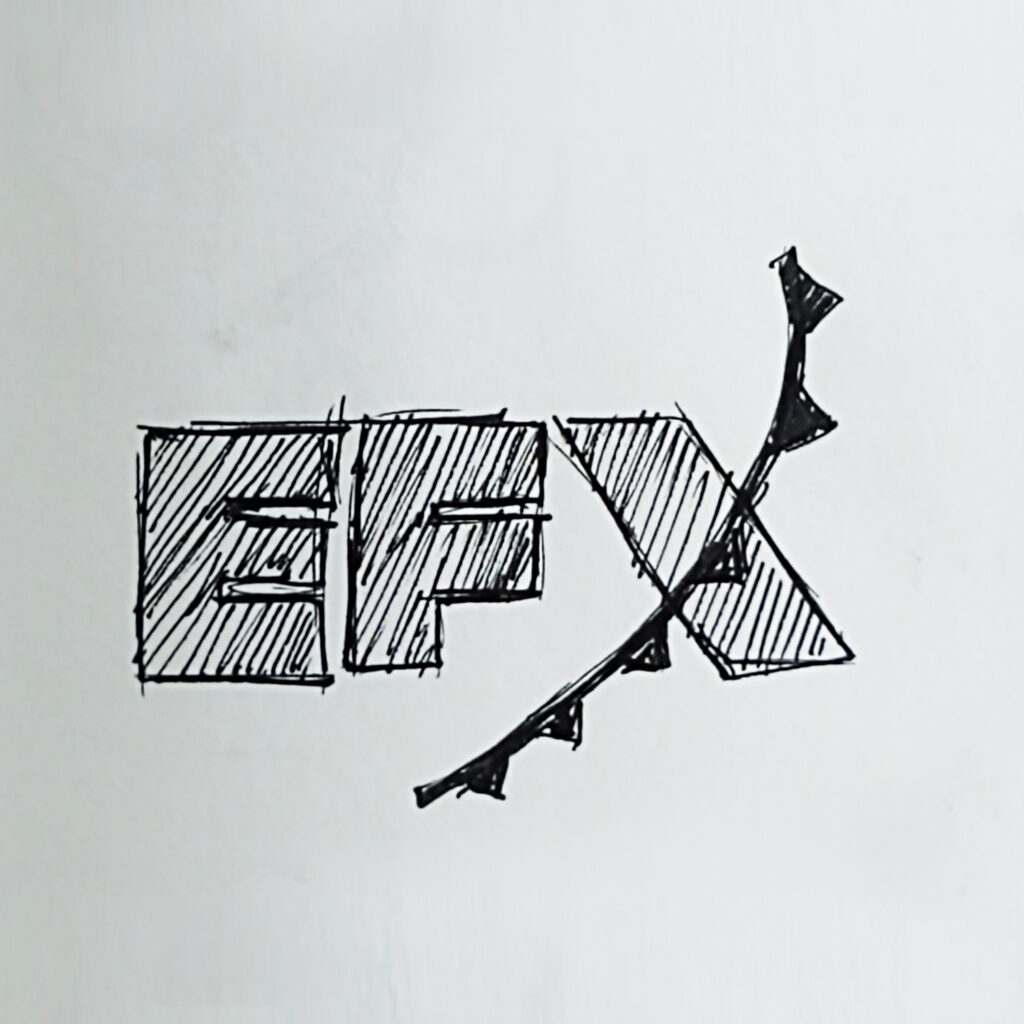
I’ve had a similar experience. We had just landed a new account, a start-up called Environmental Effects, or EFX, for short. While my boss was giving us the assignment and talking about the company (they were in the business of collecting and selling weather data and how it might affect commodities), I doodled what would become the finished logo later that day.

In both these instances, the design came quickly. Does that mean there is any less value in the design? No. In fact, when Ms. Scher talks about designing the Citi logo she acknowledges that it only took seconds to draw. But she goes on to say that it took over 30 years to gain enough experience to be able to create the logo in a matter of moments. That’s some serious unseen value.
No matter how fast or obvious the outcome, the creation of logos is never easy.
I’ve always thought designing logos is like making a roux. Picture Emeril Lagasse throwing a few ingredients (BAM!) into a sauce pan, turning on a flame and stirring the mixture together. And stir and stir and stir, whisking out the clumps while the roux thickens. As he stirs, all the goodness from the bottom of the pan he had been cooking with adds to the complexity and flavor. Stir and stir until it is nice and thick, ready to make whatever he is preparing all the more rich, deep and yummy. That’s logo design. A good logo makes everything better.
Urban Harvest is a non-profit in Houston, Texas, who plant community gardens in inner city neighborhoods to grow fresh produce in areas where wholesome food can be hard to come by. The studio I was at was asked to design a logo for Urban Harvest back in 1995. Being a freebie, my boss passed the assignment to me.

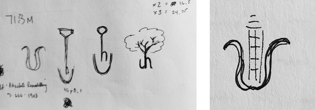
The design took a while. With paying projects taking priority, the logo took a back-burner at times, and when I did have time to work on it, nothing looked or felt right. Sketches here, tighter drawings there, but nothing seemed to stick. Weeks passed.
Finally my boss gave me a deadline — get it done.
I scrapped all my previous thinking and started over from scratch. I remember seeing a illustrated poster in an old design annual (back when art directors looked at books) where an ear of corn stood in the midle of a metropolitan skyline full of skyscrapers. That was all the inspiration I needed.

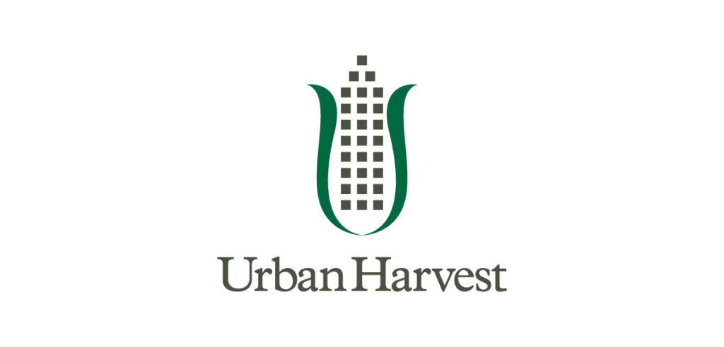
I simplified the forms, breaking down the a tower to it’s purest form, a set of blocks. The structure not only took the form of a skyscraper, where the blocks looked like windows, but also came to represent rows of corn. The outer leaves created an organic shape of a “U”, giving the tower a place to grow.
The logo became a perfect reflection of Urban Harvest — growing fresh produce in inner cities while also growing communities. The logo is still in use 25 years later. That’s value. although in recent years, someone changed the building’s color from the original warm gray to a bright yellow. In my opinion, with this one tweak to the original design, it loses the double-entendre. But even with that change, it is a unique form that has stood the test of time. Again, there is tremendous value there.
This leads me back to time as an issue. When talking about value, we’re not talking about the amount of time it takes to create something, but rather how long the logo lasts. Will the design remain relevant over the years? Will it be able to be flexible over time to adjust to different tastes, mores, and media for that matter?
That is where quality comes in, and why clients should not jump into a logo lightly. A logo is an investment, one that will pay huge dividends for years to come. When talking about the value of a logo, it is hard to put a dollar figure to it. Something so small can have such a lasting impact on a business. Or an idea.

So how do we ensure logos are valuable?
First and foremost, the design should be appropriate. The right look, feel, tonality to best visually represent the brand.
Be unique to the brand. Plenty of designers design logos to fit their style. A logo should not be a reflection of the designer, nor a competitor or anyone else, it should simply be about your brand it represents.
Strive to be timeless. Don’t follow the latest trend or reside with the herd. Where others zig, make sure the logo zags. When it comes to a logo, being different is everything.
Take the time to work through the design, instilling inherent quality and careful craftsmanship This is a two-way street — the client carefully considering how the design will affect their business and the designer responding to those concerns. Fret over the details; they will make all the difference.
